RePolymer
RePolymer is a Berlin-based biotech startup using enzyme technology to break down and rebuild plastics at the molecular level. The brand identity needed to capture this dual nature — scientific precision and activist conviction — without falling into the visual clichés of either world. The result is a design system that feels bio-industrial, kinetic, and human, reflecting a new kind of biotechnology: one that doesn’t just study materials, but fights to transform them.
Challenge
Designing RePolymer meant finding the right balance between science and activism — between the precision of the lab and the raw energy of change. The goal was to build a biotech identity that could speak to both industrial partners and citizens demanding action. The challenge was to translate molecular innovation into a visual language that feels rigorous yet rebellious — a brand born in the lab, but driven by a collective mission to redesign plastic’s future.

Explorations
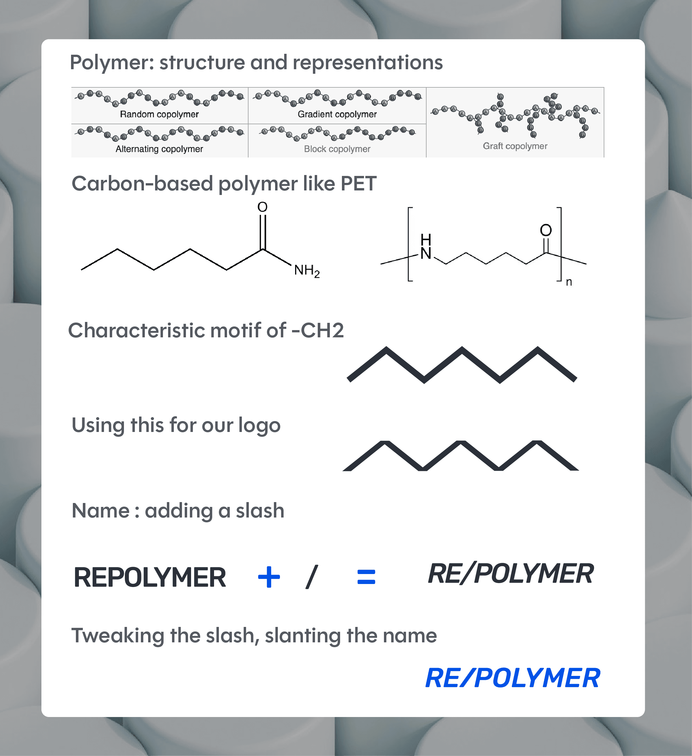
We started by exploring the dual DNA of the brand: biotechnology and environmental urgency. Visual research spanned from polymer structures and enzymatic patterns to activist posters and recycled material textures. The key was to avoid clichés — neither overly “eco-green” nor sterile corporate science. This phase led to the discovery of a hybrid aesthetic: synthetic yet human, combining lab precision with the tactile energy of reformation and protest.
Solution
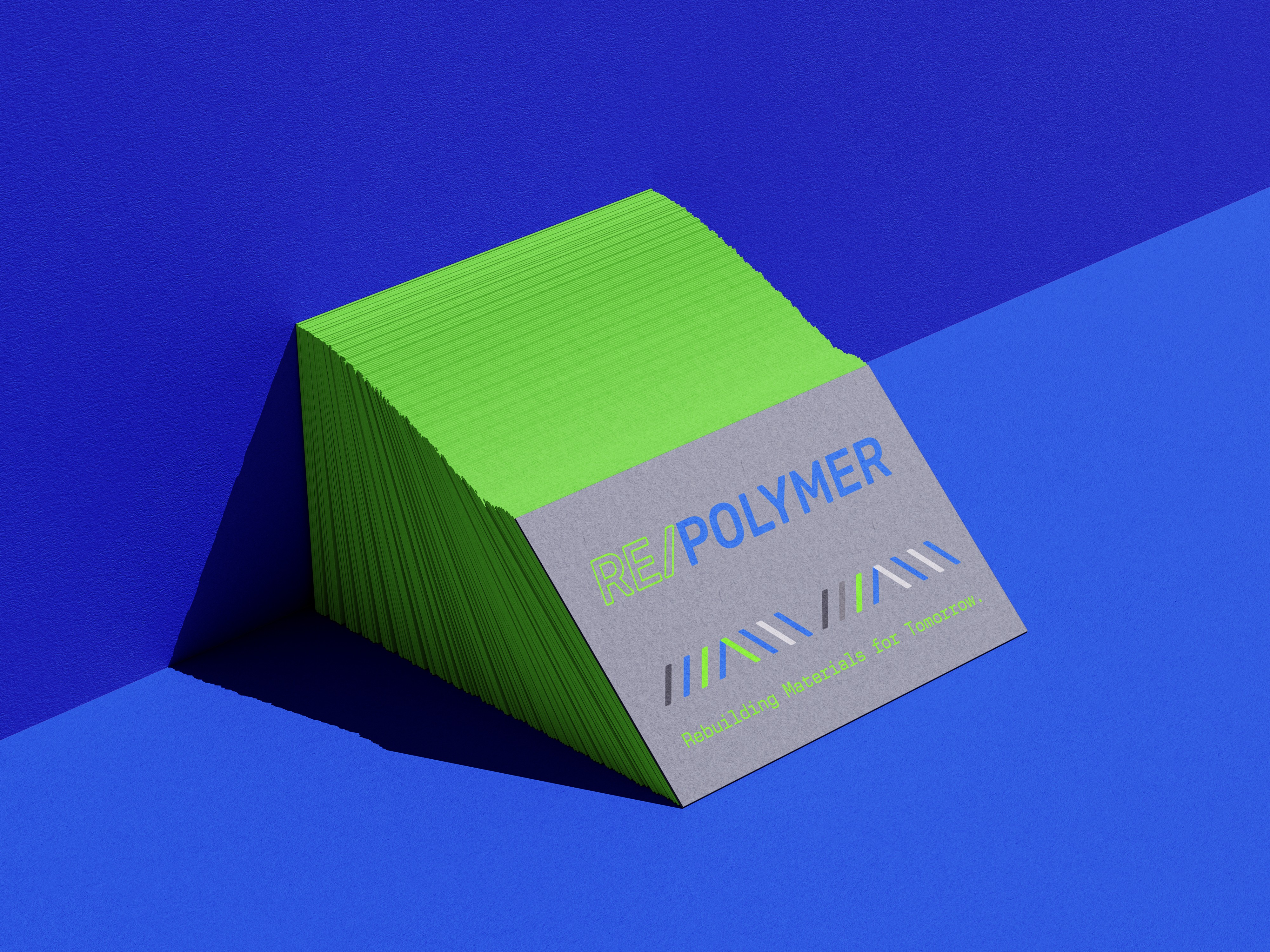
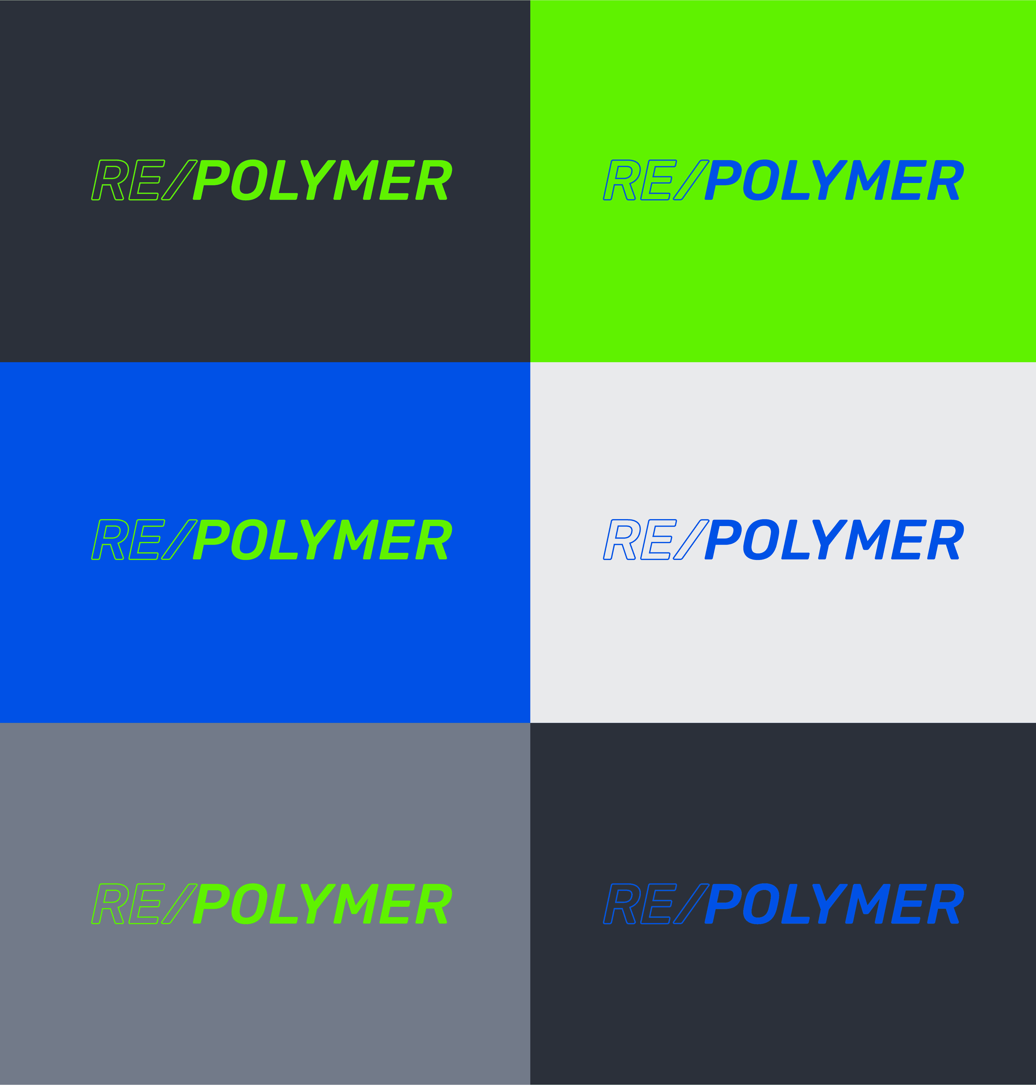
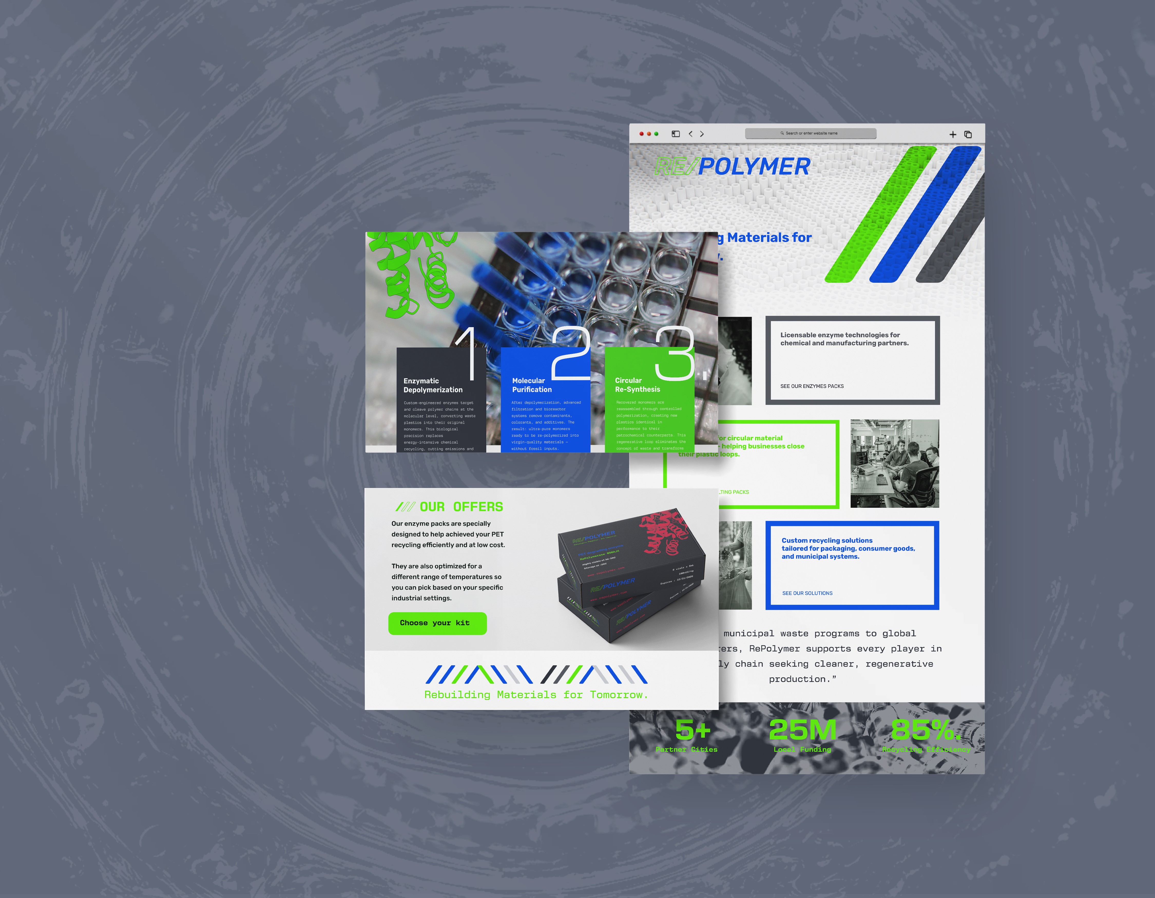
The final identity system embodies this tension. The logo, with its forward-slash “RE/”, captures the idea of renewal and action — a symbol of both reconstruction, resistance, and response. The color palette fuses acid greens and engineered blues, echoing molecular regeneration and technological optimism. Clean typographic grids meet textural imperfections, mirroring how enzymes, not machines, drive transformation. Together, these elements form a brand that feels credible, disruptive, and alive.

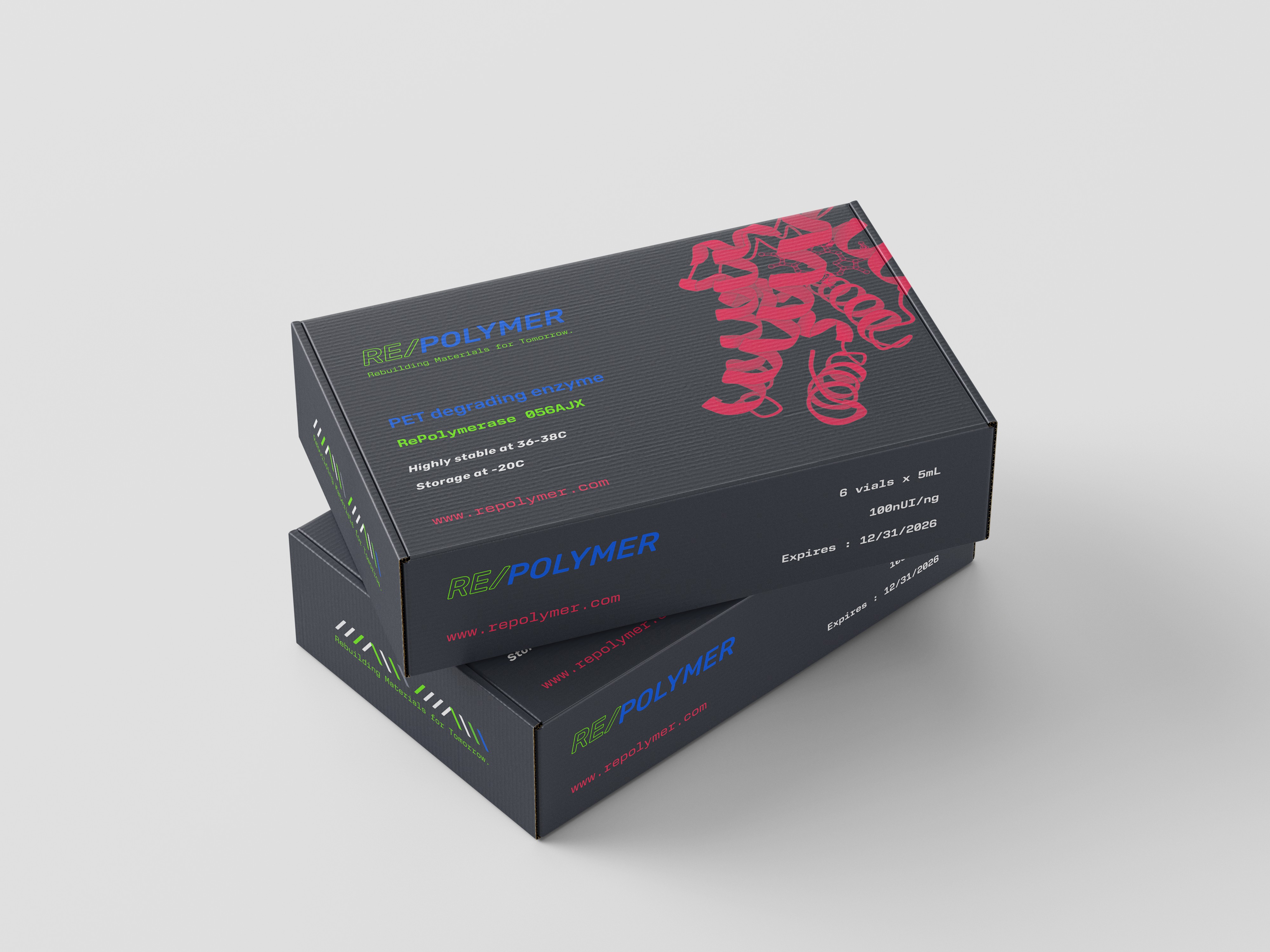
Applications
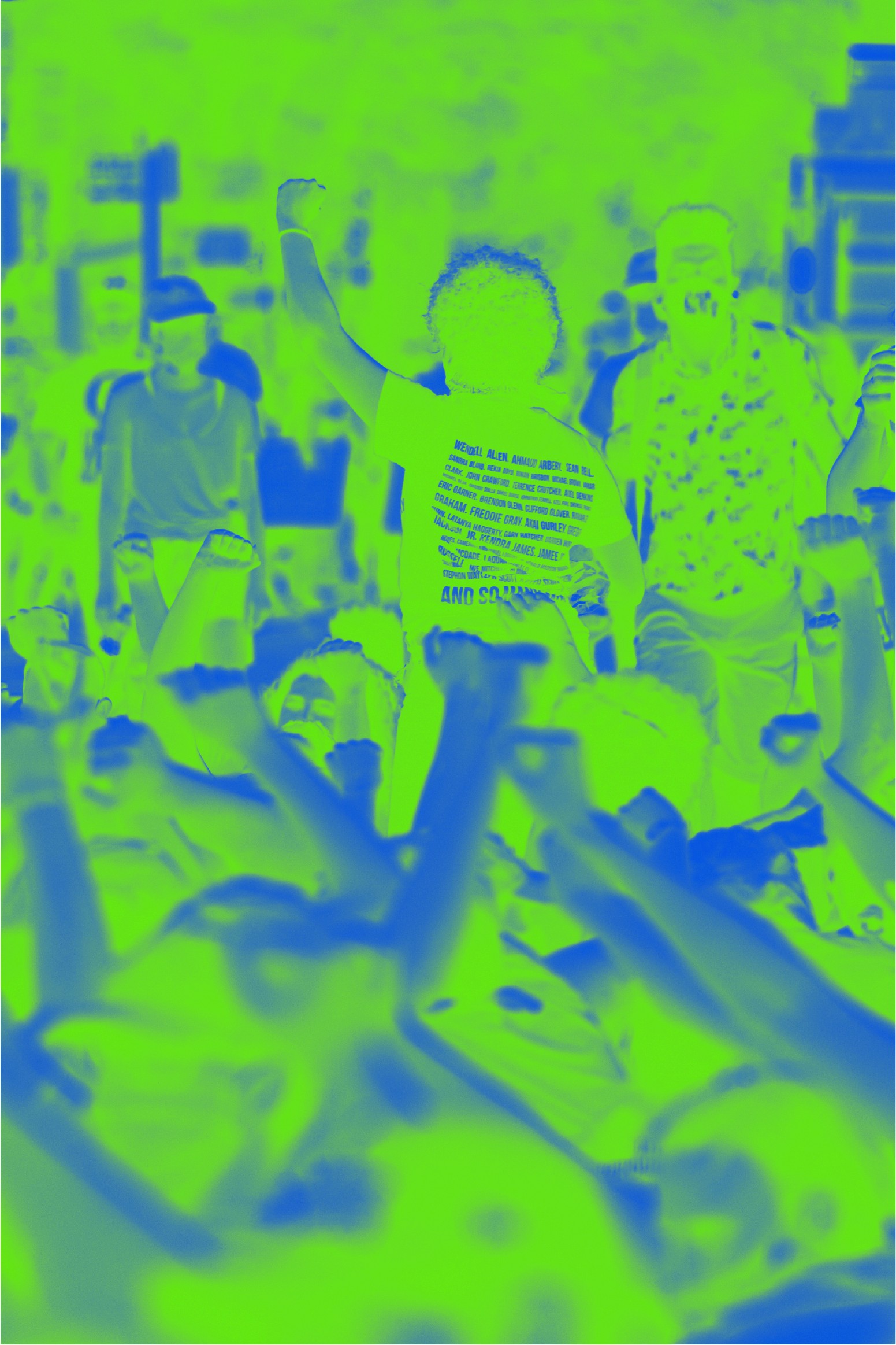
RePolymer’s brand extends across digital, print, and industrial environments. The identity adapts seamlessly from lab reports and investor decks to campaign materials and field documentation. The photographic system bridges people and process — scientists, activists, materials — showing science as action. The result is a visual ecosystem that stands for more than recycling: it’s a declaration that design, like biology, can rebuild what’s been broken.